Colour Design in Practice
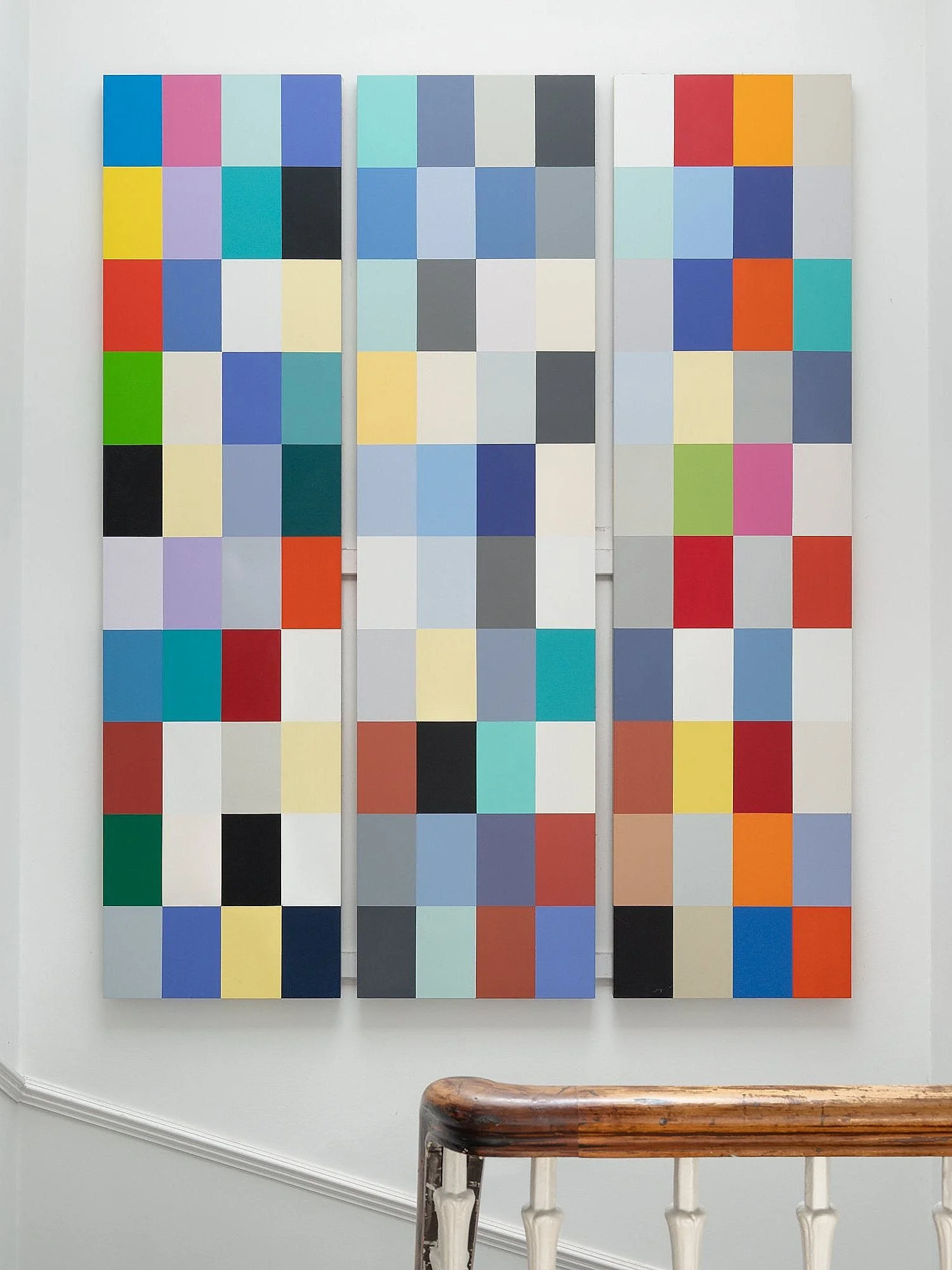
Selected work by E & F McLachlan Architects. The triptyph painting explores the predominate colours used by the practice over a thirty year period. The painting is a form of index, arranged chronologically from left to right, the final composition adjusted by eye.
Investigations in the Professional Palette,
Fona McLachlan,

Matthew Architecture Gallery, University of Edinburgh
Now over thirty years old, the Matthew Gallery was an early colour intervention in the University of Edinburgh’s Architecture school. Colour played a part in the design, specifically in the entrance portal that was designed to accommodate a new blue door set into hardwood and stainless steel surrounds. The colour places emphasis on the door within the entrance foyer and give it significance as a public venue. The walls are a mid-grey with a steamed beech hardwood floor giving warmth to the appearance. In its original conception the first column to the left as one enters the space was painted yellow to lead the eye and direct movement clockwise round the space. Each exhibition could overpaint only this one column.

Reid Concert Hall, University of Edinburgh

This project was for the redecoration and other improvements to the Reid Concert Hall. The original 1859 barrel-vaulted space was designed by David Cousin. Our research made reference to the seminal book by David R. Hay A Nomenclature of Colours, written in the same period which suggested some colour terms that had resonance with music. This informed the colour design using a strong red on the lower walls to enclose the audience and reduce the height of the space. The red was set to be slightly discordant to a family of purply greys and a deep blue in the recessed inserts in the vault. The intention was to make the space much more theatrical and celebratory as a performance and teaching space that is still in use by the Reid School of Music.

Colour in residential interiors


In interior residential projects, the practice tended to use colour to differentiate new formal elements from the existing fabric, and to clarify the architectural concept for each space.
House M is an example of the use of strongly coloured elements constructed to express and support the new uses. The palette for the insertions is more saturated, using contrasting hues and in the case of the kitchen, several tones of the same hue. Original features, where lost– such as window shutters, cornices and doors– were repaired and re-instated and decorated with shades of white and pale greys.


House R included a new family dining space and kitchen within an outhouse. Colour is used to contrast the two rooms with a warm brown-red element wrapping around the dining space, and to draw attention to the new forms such as a curving storage unit that leads towards the kitchen.
Photos: Paul Zanre


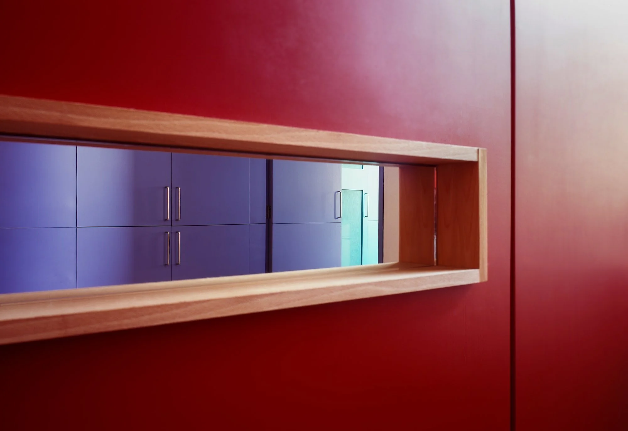
House P was an extensive project to alter a Victorian villa that had been used as a bank. While the first and lower ground floors were relatively intact and were renovated, the ground floor had an open plan with a steel frame inserted in the 1970s. This allowed for a flexible plan layout on this level with large sliding and rotating doors positioned to allow the definition of rooms within the larger space. Colour was used to articulate this concept and to introduce an element of surprise, such as a secret door giving a short cut for the family across the dining room to the kitchen.


